 | | | Photos courtesy Brandon Neff Design
| | | | | | A few months ago, I was contacted by a couple to decorate their uninspiring TV room. They wanted my help to create a space to match their dynamic energy and enthusiasm - a place for them and their two daughters to relax and be together. After installing a basic sofa and a ubiquitous recliner, they had given up any further attempts at interior design, but dreamed of a comfortable, inviting room for their young family. Compared to most projects I've worked on, the room was pretty average - it had all the essentials, but it said nothing about the happy family that used it. My first step was to find out what inspired them.
 My clients have great personal style, but very little time to create a domestic style. They spoke about an oasis they had been fantasizing about since buying the house a few years back. Like many of my clients, they had a good idea what they wanted to achieve, but had no idea how to get there. They had pulled piles of tear sheets from shelter magazines along with an iPad's worth of digital images depicting family rooms they coveted. But for more than four years the room betrayed them with uncomfortable seating, drab walls and a rug remnant impersonating an area rug. Following a round of 20 Questions we settled on a goal - to create a bright, functional and colorful space that celebrated their favorite season: summer.
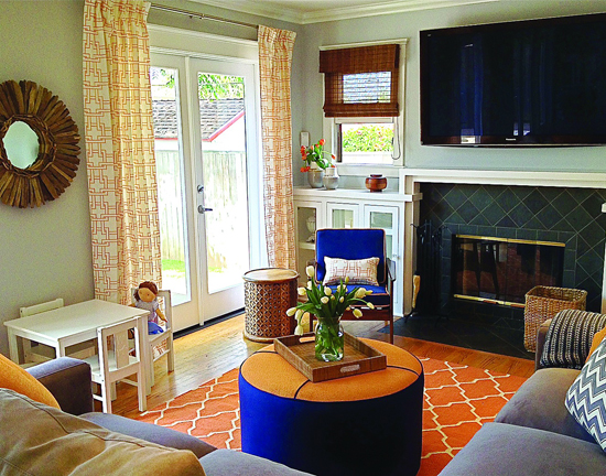
 The room had to accommodate several objectives: a place to hold the entire brood for weekly, family movie night; comfortably function as a hub for impromptu gatherings with friends; and serve as a nest to nap during long rainy days. (I think this last requirement applied mainly to the family dog!) Luckily, the space had good bones and generous French doors that opened onto a large, sunny deck.
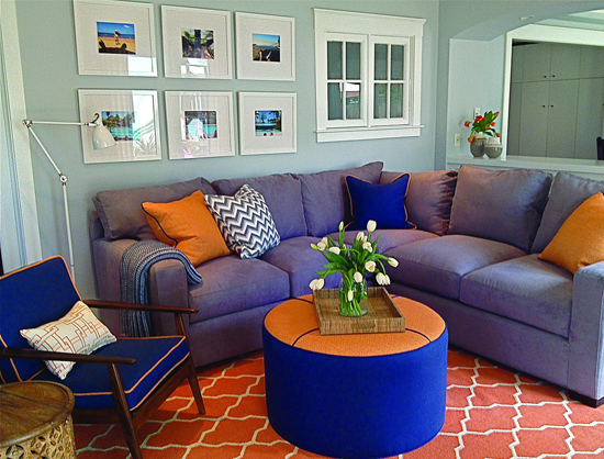
 As I've said many times in this column, I first considered the architecture of the room to help guide the decoration. In this case, the house lent itself to a California coastal style with its clean lines, tailored moldings and hardwood floors - all in all a blank slate, but with a Western exposure that could handle more intense color. Next, in keeping with the summer inspiration, I pitched the idea of citrus brights balanced with cooler, watery shades - a balanced palette of two complimentary colors: tangerine and royal blue. And, to help ground the vivid combo, I suggested adding hues of soothing gray - a great foil for neutralizing stronger colors. We were on our way!
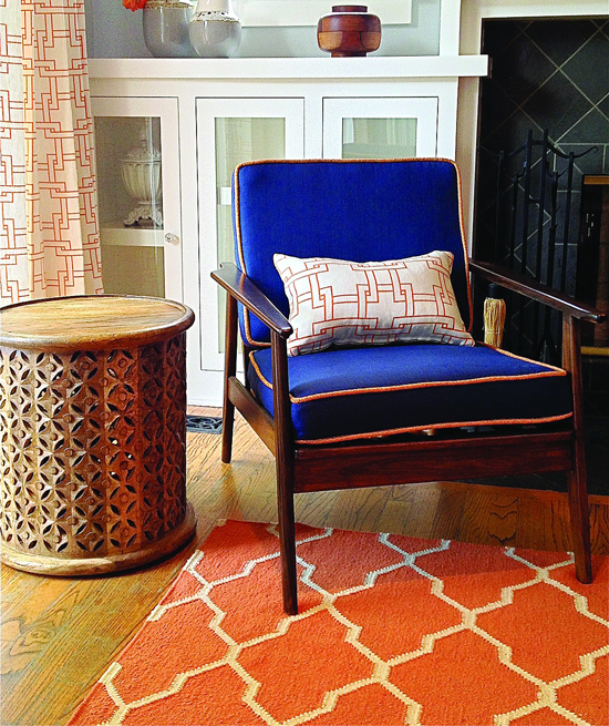
 Lastly, I needed to find a mix of interior styles and patterns to appeal both to the husband's Cuban roots, and the wife's Scandinavian sensibilities - not as easy task. I found common ground in a "collected" mix of motifs and furnishings celebrating their combined love of travel - Moroccan window patterns, Greek geometrics, island chevrons and Danish modern teaks. We employed a mix of custom furniture and a few catalog finds to achieve a "high/low" blend. I even added a few vintage pieces, like the 1960s accent chair I drove back from a Palm Springs scouting trip.
 To keep it personal, I had my clients compile a selection of travel photos which I framed in oversized white lacquer and installed as a collective piece of art. We rounded out the look with lengths of linen draperies, artisan pottery, a mid-century style sunburst mirror made from driftwood and natural woven shades. Everything has a hit of personality, and each element reinforces our "happy chic" vibe. Best of all, everything is durable and will stand the test of this busy family and their napping dog.
 By looking to their collective past, my clients have a true family room to enjoy well into the future.
 Get the look - Ideas to steal.
 For a calm backdrop on walls to anchor brighter hits of color, try Benjamin Moore's Covington Gray or Stonington Gray flat emulsion.
 Keep all millwork bright - and fingerprint proof - with Benjamin Moore's Super White in high gloss - most durable and washable.
 For floors, try a wool flat weave - natural fibers have better color saturation and wear beautifully. Try a rug pad for added comfort.
 For upholstery, always look for kiln dried frames with a mix of both down and foam - the perfect combination of firmness and loft. Nothing sits like down.
 To keep a large sectional from overwhelming the room, choose a fabric shade similar to the wall color - a simple trick to visually open the space.

|


