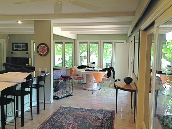
 | | | Before - low slung beams, dated tile and a choppy floor plan work against the views.
| | | | | | F all - shorter days, cooler nights, and for many, a time of transition. Lazy summer getaways spent dreaming and relaxing give way to thoughts of cozy spaces, family gatherings and rooms designed for nesting. As the season moves forward, you notice the light shifting and you find yourself reaching for that extra blanket to drape across the bed. For many of my clients, autumn also signals a season for reevaluating the way they live, what they surround themselves with, and for discovering new ways to love their home. Once overlooked or ignored rooms can be transformed into a favorite place to entertain, to lounge or to simply escape. We evolve - why shouldn't our home?
 This isn't just about new trends because I don't believe in trends when it comes to good interior design. This is about living at your best, and designing a home that reflects your best life. This speaks to falling in love with your home all over again, and looking beyond the walls and rooms and discovering what connected you to your house or apartment in the first place. Ask yourself, does your home make you smile when you walk in the door? Does your space represent who you are and what you're passionate about? It can.
 This week's project really speaks to how thoughtful choices and a passion for reinvention led my clients to re-imagine their home into a very personal expression. Lisa and Richard's home in Lafayette was, at first glance, unremarkable. It was large with spacious rooms centered on an expansive lot - the grounds reflecting more about their passions than the interiors. Much of the furnishings seemed to crowd the rooms, and the layout denied the main room's proper flow. (Did I mention the foosball table in the living room?)
 Much of the "eclectic" furniture was a hodge-podge of pieces collected over years in different homes, former lives as parents and durable seating that they couldn't part with because it still did the job. Er ... sort of. People, durability does not a well designed home make. Sure, it's nice when things last, but hanging on to the past can limit your creativity. Rather, think about a functional home that serves your life in the present and build a space that caters to how you live today.
 Clearly, my clients were eager to create a home that spoke to their lives now - newly empty-nested and ready for rooms that they could spread out in. The challenge they presented me was to uncover a fresh perspective on the home they wanted to stay in, while respecting their tastes as a couple, as well as imagining a welcoming home that worked for entertaining. Not a small task!
 The project was less about a gut job, and more about peeling away old layers to create new vistas. Lisa and Richard loved the views to their tree lined backyard, and wanted a better vantage point to enjoy their combined love of nature. (Did I mention the foosball table in the living room?)
 The best part about this project was my clients - this couple has charisma, and not a small amount of knowledge of design. Rarely, do I get the opportunity to discuss the likes of Stark, Miller, Nelson and Wormley with clients who can hold their own. From Richard's polished skills as a nature photographer, and their wide tastes in art and decorative accessories to their shared appreciation for 20th century architecture (they once lived in a Frank Lloyd Wright designed home) - they had a strong aesthetic sense of what they were looking to accomplish, and allowed me to help shape it into clearer focus.
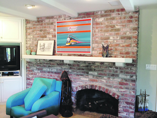
 The best example of how we accomplished this was in the family room - the largest space, but the most poorly laid out room in the house. It featured obtrusive cabinetry, an overpowering brick fireplace and low slung decorative beams on the ceiling that made the whole space feel claustrophobic. Additionally, the lighting was underwhelming, the furniture too large and out of scale and the windows left unadorned. If I sound harsh, it's only because the room needed some tough love.
 After convincing my clients that "everything must go," we removed the interior island and cabinetry dividing the room, removed a rather large, clunky mantel, clad the entire brick wall behind new drywall to create an installation space for art and photography, stripped away the beams and low slung header, and added much need recessed lighting to highlight all of the new furnishings. A gorgeous paint color and luxe fabrics were added - all inspired by the lovely heirloom area rug that grounded the space.
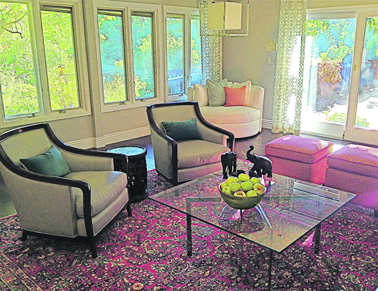
 With a palette of rich reds, warm tans, teal and cream - along with espresso wood floors and polished chrome accents - the room emerged transformed into an elegant, but comfortable gathering space while keeping the best views of the garden. The lush yard was now highlighted by a new vantage point from which to enjoy it. A mix of custom designed furniture, mid-century pieces and even a couple of re-purposed chairs now work in harmony to bring a fresh, chic and relaxing vibe to a well loved room. Custom paint colors on the walls convey a soothing calm throughout the space, and I even nudged them into a rather upscale wallpaper in the elegant dining room - a nod to Lisa's tug toward a little Park Avenue moment.
 Tip: When wallpapering a room don't be shy - paper every wall for full effect. A single accent wall in wallpaper looks as if you ran out of supplies.
 I often speak of the transformative power of good design. Color moves us. Art inspires, and can even transport us. Take a moment and look around your space - find what speaks to you and what feels out of place. Perhaps, this too may be your own season of change.
 BTW, the foosball table found a new home.

|


