 |
|
|
Green is known for indicating balance, growth, stability, abundance and peace - all things we want to bring into client homes and spaces. Photos courtesy Couture Chateau llc, photography by Couture Chateau LLC
|
|
|
|
|
|
I love the color green. As springtime awakens, industrious flowers, lit by the warmth of the sun, soften our world. This month, as our excitement for impending spring sprouts, I wanted to share three unexpected places where you, the stylish suburbanite, can successfully use the color green.
 Trust me when I say that while I love green in all shades, memories of bad avocado shag carpet occasionally loom in my mind, so I am cautious with tone and saturation - two important things to consider when using the color. One wrong undertone and you have moved from something beautiful to something reminiscent of, say, murky pea soup. Saturation issues make colors read flat and chalky - and not in the cool, hip matte sense of the word.
Many times when we complete a client project, we will share simple collage photos with color combinations so stylish suburbanites like you can choose accessory items throughout the year that work within their larger color scheme. For this month's article, I am sharing photos in that format so you can have a hands-on application.
One of my favorite apps is PicMonkey (www.picmonkey.com). We use it constantly to create gorgeous collages. They have a free version for the casual enthusiast. The app is especially fun to play with and useful if your eye is not naturally geared to putting color combinations together, such as green with purple. You can simply pull pictures and collage them to see if they work and then head out to shop.
Here are three of my unexpected uses for green:
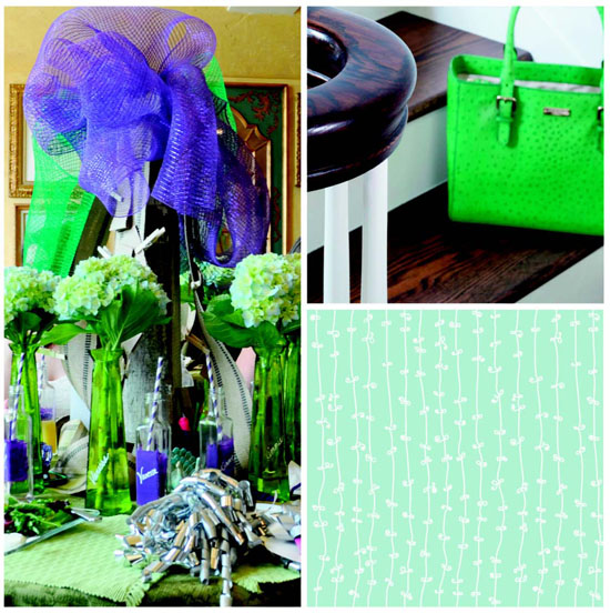
1) At the party. We've all seen those gorgeous, simple white and cream tablescapes with single colored candles and décor. I love them. But every now and then you need some all-out joy. This past year we hosted an event for over 50 ladies and had a field day with the color green. From the linens to the vases, which served as the unusual "goodie bag," the color was a hit.
We married green in all shades - and I do mean all. I broke every proverbial rule with respect to color combinations, watching out, however, for bad undertones (the root of the color). It was fabulous, layered and rich. Purple and blue were our accent colors in the straws, ribbons, dishes and even the floral arrangements.
For your next luncheon or spring party, consider using green as your anchor. It doesn't have to be childish or silly. (You're not trying to create a Barney party.) Stick with strong, simple elements and layer for effect. We used simple glass buffet plates in square shapes and accented with smaller salad bowls in green blown glass.
And, of course, don't forget to match your purse.
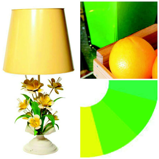
2) In the kitchen or family room. Can you imagine a green piano? Well, we have one from a very long time ago, adorned with green and yellow accents in my kitchen. For springtime accents on the black built-in shelves, I will often switch the accessories to things like bright yellow lemons and reverse-painted kelly green glassware. It adds the perfect pop with a bit of whimsy.
Feel free to go bold. Switch out seasonal accessories or find unique antique lamps that make a statement. You don't always have to paint over antiques to mix them into modern color schemes. Take risks, have fun.
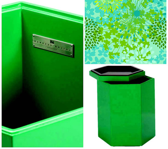
3) Laundry rooms. One of the places that could use a cheery color is the utility room where we spend so much of our time. The combination of kelly green and blue fosters a good working vibe and provides a soothing palate. I like a peaceful atmosphere when faced with things like laundry, mending and folding.
You can use greens and blues in combination with any color washing machines. Include an offbeat piece of furniture as a laundry basket, like a Barclay Butera piece, which is more stationary than movable but is a great touch for small visible laundry areas. The nice part? When the kids head off to college, they can take it with them and use it for a side table, storage or to remind them that when it's full, it's time to do laundry!
Whatever your opinion of green, try to incorporate differing shades of the color into your décor. It's beautiful, adds stability and has a prosperous feel.
Blessings this March, stylish suburbanite. Let me know how your PicMonkey adventures go, and if you love the app as much as my team and I do.
|