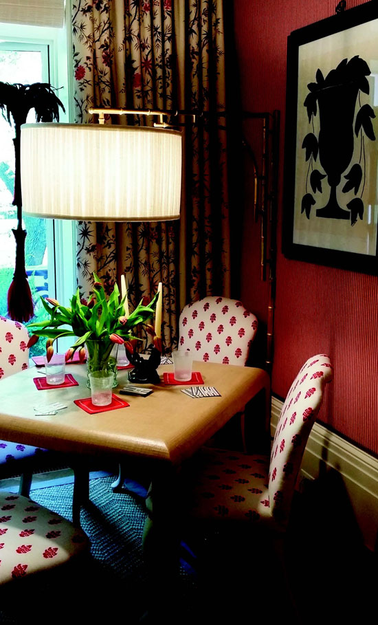
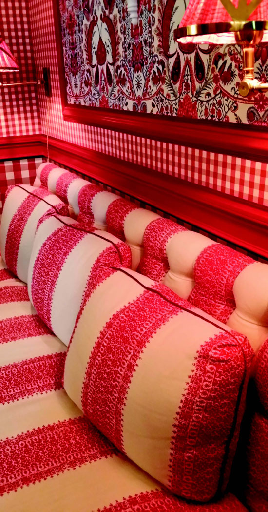
 | | | Mark D. Sikes' red gingham room. Photos courtesy Couture Chateau LLC | | | | | | What do the Kip's Bay Decorator Show House, International Contemporary Furniture Faire, MoMA, Frieze Art Faire, Wanted Design and the National Stationery Show have in common? They are all parts of New York's Design Week, also referred to as NYCX or NYCXDesign, www.nycxdesign.com.
 This month I am excited to share on point trends that you can implement this season as stylish suburbanites.
 As my co-workers and I were being driven from openings to private parties we had to pinch ourselves. Design as a profession is usually hands-on hard work, but for this week a group of 11 other women and I were sponsored by several larger brands to do nothing but attend and blog and post on social media. Dream time. During the entire trip, I was thinking about pieces that would translate into real life in Lamorinda.
 Here are my top trends relevant to our Lamorinda lifestyle:
 1) A return to traditional: Mark D. Sikes hit it out of the park with his red gingham room. From the upholstered walls layered with red painted moulding to the shaped wicker dining table and chairs, each element in his room easily translates into real life.
 What I loved was his use of different pieces of furniture in a cohesive way. The room felt flexible. Armless banquettes settled in two corners, a simple side chair in another and my first thought was, brilliant! When the large dinner party night arrives, these could be pulled up to a fully extended table. For every day, you had several beautiful spaces and places to choose for your morning coffee. It was stunning.
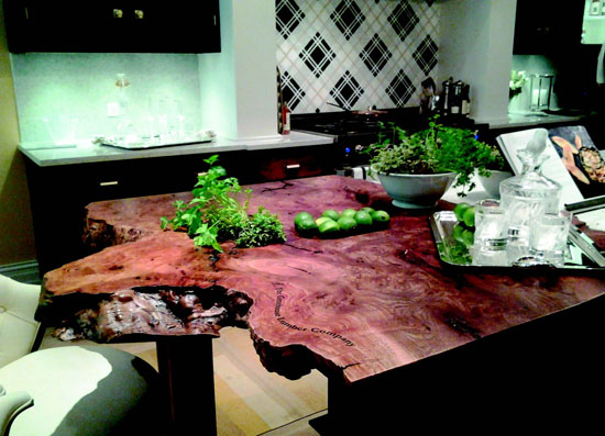
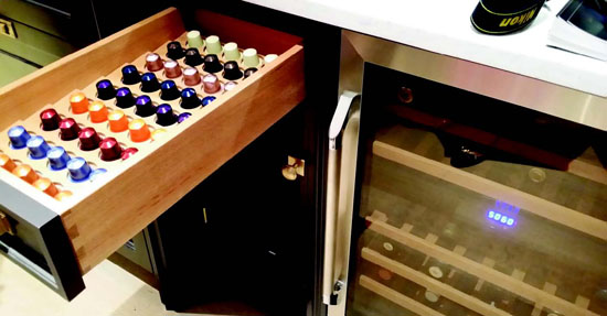
 The other standout room in my opinion was the kitchen. Christopher Peacock designed the cabinets replete with custom brushed brass hardware; Dacor supplied the built-in appliances and Kohler the sinks and faucets.
 Attention to detail and mix of surfaces appealed most to me. No boring white kitchen when you add plaid tile backsplash, live edge burl in one section of counter and face several individual drawers with cuts from the burl wood. Absolutely beautiful.
 2) Real life arrangements: I noticed several consoles were layered with more realistic displays. It was as if someone actually lived there. Gone are the days with books piled so high you could never hope to read one next to a bust of some Greek icon you should know, but can't recall, and an oddity no one dares to ask about.
 These types of displays popped up in several shows. I felt the theme of real life penetrated through to the fabric and rug introductions as well, which leads me to my third trend.
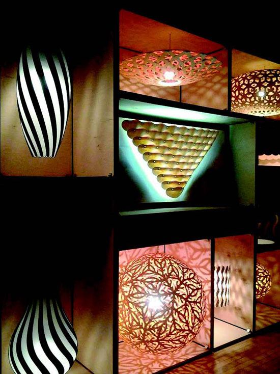
 3) Natural textures either in small artisan runs or hand-made: From the lighting at Wanted Design to the carpets and rugs at ICFF, natural was everywhere. Two favorites were the natural woven carpets and the sculpted lighting. Several trade manufacturers were weaving either by hand or in small quantities true craftsman product in wood, wool, cotton, jute and even metals.
 There will always be ultra-modern and cutting-edge design at expos like this. I am fine to see and enjoy the inspiration, but at the end of the day what I noticed most: Designers are creating for more intimate spaces, human scale and tactile experience.
 Even the lacquered pieces and minimalist European designs had a softness to them. Whether it was the curve where previously we would have found a straight cut or an embellishment or bright color where three years ago it was stark black, things felt approachable.
 You can find more pictures and thoughts over on the blog at http://www.couturechateau.com/blog or on my Instagram: annlmcdonald with the hashtag #blogtourNYC.
 Have a blessed day, until next time!

|

