| ||||||
1) Art hung too high. I see this mistake often. It seems trivial, but even a piece of art hung a few inches too high can make a whole room feel "off." Many like to use the rule of thumb of hanging art at eye level, but I think even that can feel off, especially if you're above average or below average height. I prefer to hang art in proportion to the furniture piece it is above (i.e. dresser, sofa, bed, et cetera). The size of the art will also make a difference. A larger piece will obviously be able to hang higher than a smaller one. For instance, if it's a sofa or a headboard, start with 5 inches to 8 inches between the top of the furniture and the bottom of the art. Also take into consideration the height of your ceilings. Lower 8-foot ceilings you may want less space between the furniture piece versus higher ceilings. I still prefer to err on the side of hanging the piece lower and closer to the furniture.
2) Decorating around something you don't love. I hear it all the time: "I don't love the oriental rug (or whatever) but it was my mother's (or it cost a lot of money) so I kept it." The problem with decorating around something you don't love results in a room you don't love. And if you read my article last month you know where I stand on this. It's okay to let those pieces go if you do not love them. Or at least move them to a space that you use the least. Life is too short to live with items that don't bring you joy.
3) Choosing color first. Without doubt, color is the biggest thing I find people get wrong. Color is not easy and most homeowners can find it challenging to select. A common mistake is choosing the wall color first before anything else is in the room. I always tell clients it is much easier to match a paint color to a fabric, a rug or art, than it is to match the fabric, rug or art to your wall color.
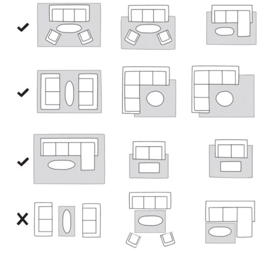
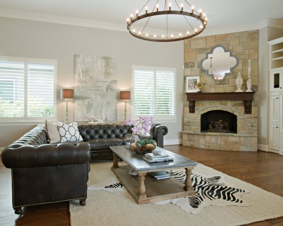
4) Choosing a rug that is too small for the space. I like to call it Rug Island. You know, where the rug floats in the center of the room not touching a single piece of furniture? I understand that rugs can be a large investment and many of us have kiddos and prefer not to spend a lot on a rug so we opt for an inexpensive 5 X 8 size. A great way to save on cost is to have a local carpet store make a rug out of broadloom. For living rooms a good rule of thumb is to either have all the furniture pieces on the rug or at least have all the front legs of the furniture on the rug.
5) Piecemeal decorating. Often times when I go to a consult the client is stuck moving forward because they started to decorate without a plan. Maybe they recently moved into their new home and quickly ran out to purchase a sofa and chairs or ordered a rug online and realized the color was wrong. Then they tried to use their existing coffee table but it now feels too small for the space. And now they find themselves struggling to make things "work." Decorating piecemeal or buying things one at a time is the most difficult way to decorate. Having a plan in place with room measurements and fabric swatches will ensure that less mistakes will be made. Even if you are unable to purchase all the items at once, it is still better to have the plan in place and purchase as your time and budget allows. This is why clients love our Designer Day package, because they can hire us to create the plan and they are able to execute it when they are ready.
If you have made one or more of these mistakes please know that we've all been there! And when in doubt, Google it! There is a plethora of information at our fingertips that 15 years ago didn't exist. I'll leave you with one of my favorite quotes from designer Charles Eames: " The details are not the details. They make the design." Until next time dear friends!


Reach the reporter at:
