| | Published August 17th, 2011
| Mid-Century Remodel Handled With Care
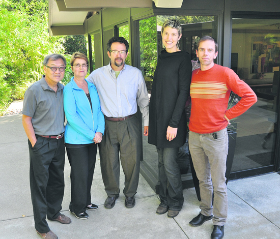
| | By Cathy Tyson |  | | From left, homeowners Gordon and Dorian Chong with remodel team Alan Bergtraun, Eliza Hart, and Stewart Wright in the back yard.
|
With only one prior owner leaving the property mostly untouched, the stars aligned for a group of three architects to collaborate on an artistic remodel of a Lafayette home that respects its original character. Eliza Hart, Stewart Wright and Alex Bergtraun saw potential in an Eichler-esque home in the Hidden Valley neighborhood - although dated, "it had good bones," said Bergtraun. Hart was good friends with the original owner's granddaughter, who wanted to make sure it didn't get torn down. The team managed to modernize and expand the home using sustainable materials and integrated unique color choices and textures throughout.
 "All three of us had a shared vision, and worked together on the design" said Hart explaining that since the house was built on spec, they had a blank slate to work with. "We weren't afraid to open up the walls," added Hart, noting there were some pleasant surprises, like the original copper piping under the floors that provided radiant heat. All the pipes were in remarkably good shape, so put to work once again, with the addition of a new boiler.
 The trio sensitively reworked the home from floor to ceiling, and positioned walls of windows to take advantage of the surrounding lush natural landscape. Generous, well-proportioned rooms flow from one to the next in the five bedroom three bath home.
 Once the jungle outside was tamed, clearing away years of unmaintained brush, a new tranquil zen-like yard began to emerge. A fence was moved back toward a natural gully to do double duty, improving the view and keeping the deer out. Adding multiple skylights at key locations provided light at the ends of the spine of the home illuminating both ends and adding an airy feeling. The new homeowners love the lighting - in addition to the windows and skylights, the architects included built in valence lights on dimmers that emit a soft glow on the ceiling.
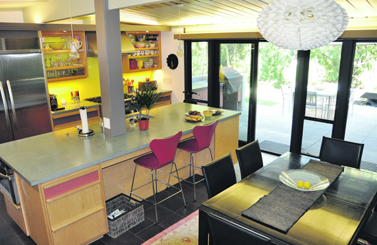
 The former funky, unheated rumpus room has been transformed into a tranquil master suite with a wall of built in cabinetry. Pristine, unadorned functionality continues in the master bath featuring concrete counters, large rectangular sinks and fresh white rectangular tile. Same size, but different color - bright yellow tile is a focal point of the kitchen, echoing the design theme. Concrete countertops are also repeated throughout the home.
 When finished, even this gem was a victim of a tough real estate market, and sat unsold for a year. The current owners started a home search a couple of times. On their first foray into house hunting - they saw the recently renovated property and were intrigued - but not quite ready to make a decision. Twelve months later, the home was still on the market so they took a tour on a Friday and made an offer on Sunday. Unfortunately on Monday there were three offers. When it rains it pours, but the sellers ultimately chose Dorian and Gordon Chong's offer because of Gordon's profession - he's also an architect - they knew their diligent work on the design would be appreciated.
 The Chong's prior home was perched high in the Berkeley hills with expansive views of multiple bridges. Although they loved the view, they weren't in love with the 38 steps required to get to the garage. Throw in endless schlepping of groceries and life's essentials and it was time to make a change.
 Having lived in the home for about a year, the couple has settled in with their Schnauzer, Shelby, to enjoy the breezy informality of their new and improved Mid-century California modern remodel. This residence was recently included, with seven other unique homes, in the East Bay's first American Institute of Architects home tour celebrating design excellence.

|
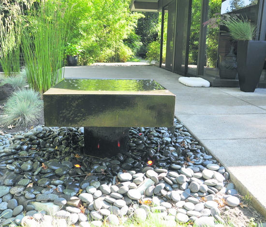
 | | Unique water feature lends tranquil element to patio area.
Photos Andy Scheck
|  | | Yellow rectangular tile sets off kitchen with open, custom Europly shelving designed and constructed by architect Stewart Wright.
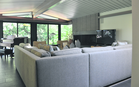
|  | | Spacious living room featuring new cement cladding on existing fireplace.
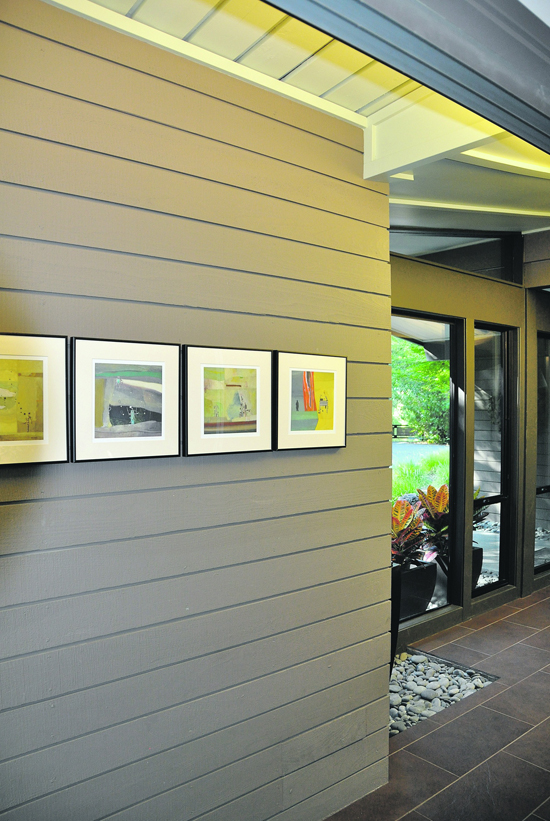
|  | | Re-purposed original decking was used as a wall treatment in the main hallway.
| | | | | Advertisement | | |
| | | print story
Before you print this article, please remember that it will remain in our archive for you to visit anytime.
download pdf
(use the pdf document for best printing results!) | | | Comments | | |
| | | | | | | | | | | | | | | | |


