|
|
Published April 9th, 2014
|
The Home Designer
|
| Great Wall of Style |
| By Brandon Neff |
 |
| Phillip Jeffries makes beautiful grasscloth papers in dynamic colors. Photos courtesy Brandon Neff Design |
After its heyday from the 1930s, through the beginning of the pivotal social and economic shifts that were the 1960s, American design didn't embrace wallpaper for decades to come. Once the height of chic decor for the home - no house was truly finished without a properly decadent wall covering - papers took a back seat to plain wall paint ranging in hues from off white to Swiss coffee. Can we all agree to never use Swiss coffee again?
 I can remember as a child tagging along with my mother on a rainy Saturday to Ace Hardware to pick up a few gallons of fresh paint for the living room. While I was off exploring the color chips at the far end of the display looking at vibrant reds, blues and greens, my mom was at the opposite end firmly planted in front of the whites. She couldn't fathom using a color other than off white. "It matches the draperies," she'd say, pulling me kicking and screaming from my controversial end of the samples' wall where those darker, vibrant colors were the Devil's work.
 I think I knew then what I'd end up doing as an adult. Give me color!
 Trends change, thank the Lord! Remember chintz and ruffled bed skirts, and mirrored ceilings! Yikes! Perhaps, they were once the cat's pajamas - not so much anymore. Unfortunately, when wallpaper was used during the Nixon to Clinton eras, it was uninspiring and a bit dowdy, relegated to bad hotel rooms, country cottages, Nancy Reagan's White House and Grannie's retirement home. But the decorating austerity that became the apotheosis of the well-designed American Home up until the late '90s finally changed, and the 21st century ushered in a new, fresh and glamorous age of high design mixing period styles with traditional and modern classics.
 Thankfully, hand painted, hand blocked and re-issued archival papers, along with an ever increasing fresh stock of innovative motifs from today's designers have flooded the design scene making for some stunning results. In my practice today, wallpapers have become synonymous with adding individuality and texture to an often overlooked, or ignored opportunity in a space. Why have a bland, solid wall color, when you can transform your room into something inspiring?
 Sure, I'll always use paint - some spaces look best with a clean backdrop. But, for many homes where there's not a lot of architectural interest, or the walls aren't in good condition, wallpaper can elevate them in an instant. From hand painted garden scenes and stunning murals (De Gourney makes some of the most beautiful), to graphic geometrics and bold metallics, the range of looks are transformative. Many of the established, venerable design houses like Colefax & Fowler or Schumacher are reimagining older releases in new and dynamic color ways. There are a new crop of smaller wallpaper companies like Walnut (walnutwallpaper.com) out of Los Angeles that are releasing new and original wallpapers in irreverent patterns, styles and materials.
 One of my current obsessions is grasscloth. Once, it was only available in a limited number of colors - all looking more Japanese Tea Garden than urban chic. But today grasscloth comes in myriad colors, textures and motifs. Some of my favorites are tone on tone geometric designs like hexagons or diamond patterns woven into the fibers.
 Grasscloth is one of the easiest and most forgiving papers to apply - some are very DIY friendly. They come sold in wider rolls than most papers, so they cover more square footage, saving you money. Try Ralph Lauren Home for some great inspiration.
 Fear of commitment? Aren't we all? For apartment dwellers, or those skittish about the permanence of wallpaper, there's a new range of temporary, peel and stick options. While not as detailed as some of the larger design house offerings, these temporary paper companies are rolling out more selection every season - easy to install, easy to remove. For renters who crave more than builder beige walls, these are perfect. A couple of great resources are tempaper.com, and designyourwall.com. Check out the "faux bois" papers that mimic wood grain - super stylish in a family room or guest bedroom.
 I probably don't need to remind you, but the paper you choose will only look as good as the wallpaper installer who hangs it. This is not an area to scrimp on. Choose wisely, and hire a pro. The walls will need to prepped properly and the quantity of paper you order should both be done by a specialist. You want a pattern match on wallpapers that have a repeating motif, so ordering properly is essential. This isn't a Home Depot run kind of project.
 Lastly, get samples before you decide. Most companies offer what's called a "memo" - tack this to the project wall and live with it for a while. Wallpaper will be the least mutable item in your d�cor, so it has to work on many levels.
 Looking for more inspiration? Check out my website, BrandonNeffDesign.com, and shoot me an email - I'll add you to my free newsletter subscriber list.

|
 |
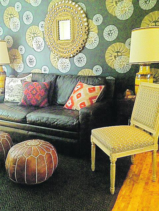
| A dreamy Fornasetti wallpaper brings this home office to life. |
 |
| Brandon Neff is a Bay Area based
Interior Designer.
He can be reached at
BrandonNeffDesign.com or at brandonneffdesign@yahoo.com.
|
|
|
|
|
 |
|
|
|
|


