|
|
Published May 6th, 2015
|
Stylish Solutions
|
| How to Execute the Perfect Blue and White Vignette |
| By Ann McDonald |
 |
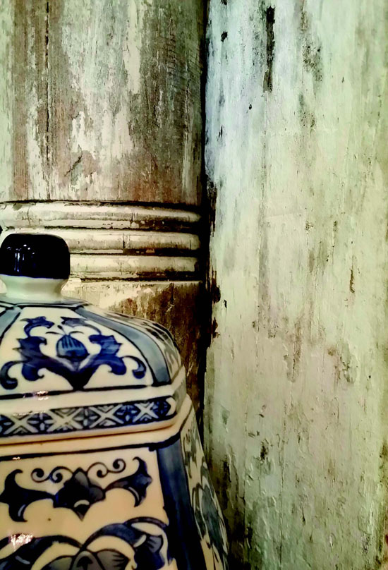
| There are several ways to display blue and white. Here we paired a hand painted vessel with historic column fragments by looking to patina on the columns and brush strokes on the china. The contrast and simplicity is incredibly striking on one client's console table, which is a 17th century French Boulle. Photos courtesy Couture Chateau LLC |
This past week was the High Point Furniture Market where two times a year designers and manufacturers descend upon North Carolina for over 11 million square feet of inspiration, new product introductions and educational seminars. Each market has its own personality and flair. What is trending this spring? Gorgeous accessories including, of course, the ever-appropriate blue and white combination.
 As you make your home summer-ready, I wanted to share how to make beautiful accessory vignettes mixing, in this case, all manner of blues with whites. Note that whatever we do with blue, you can substitute any manner of color or pattern (think black, purple, green, gray and even a rich yellow) and pair it with whites. The same rules of grouping apply.
 I like building accessory collections over time instead of trying to purchase items in one swoop. This helps with budgets and especially once my team and I exit the project, clients have marching orders for their travels. "I'm building a collection" is the perfect reason to pay for packing and freight home for a gorgeous antique cachepot from France. Having an eye toward building collections over time also means if you are an estate sale junkie, you can hunt with purpose. This works at local discount home stores as well.
 Recently on an accessories buy for a photo shoot, we spent $109 including tax at Home Goods and found five pieces of blue and white, including four ginger jars! I call that hugely successful. We joked it was less expensive than the morning coffee run when everyone is in the studio.
 Keep your eyes sharp and when you find items you love add them to your rotation. These vignettes work beautifully on bookshelves that need a summer cleanse, console tables, dining tables or even bedside tables holding fresh flowers.
 Remember to complete the look in the space you are refreshing by attending to things like summer slipcovers or fresh pillows (see last month's article in the online archives). I recently swapped out my dining table color scheme from green and yellow to blue and white for the summer. The dining chairs are getting new seat slipcovers in washed linen for easy care over the summer entertaining months. Geometric blue and white pillows, which made an appearance for a bridal shower, are being reintroduced into the dining room as seat accent pillows. Remember to rotate, rotate, rotate! Everything can become fresh in your home with different placement.
 Here are your five 'must dos' to create 'wow-worthy' vignettes:
 1) Symmetry in numbers, not in placement. What do I mean? On my entry hall table, there are two small round flat-lidded pots and two large ginger jars. The small-lidded pots are a pair but are not displayed in symmetrical composition. There is enough movement to stay interesting, but not so much variation that it's overwhelming.
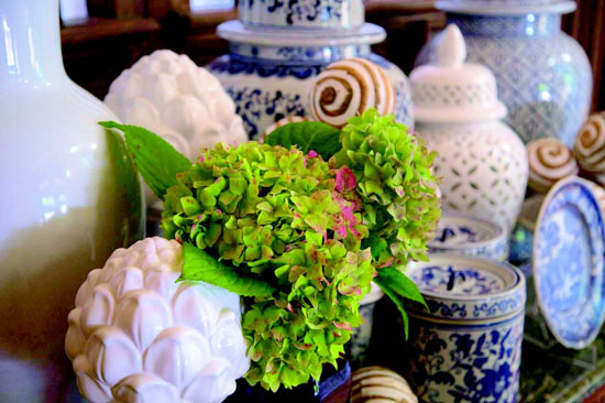
 2) Vary circumference, material and height. One of the biggest mistakes people make is purchasing items that are sort of similar. They might fall into the trap of buying items that are four different heights, but they are all ginger jars. My challenge to you is to mix up those items. Add white stemmed ceramic artichokes, an oversized ceramic lamp, a pierced ceramic-lidded jar and an antique plate displayed on a holder.
 3) Mix in one unexpected color. With blue and white I like to add a sand or beige. It balances without competing. Add some simple textured rounds in beige and off-white to a collection.
 4) Add something living. Please, with the bounty and beauty of summer, use fresh flowers or a potted blooming plant. One of my favorite things to do is use a blue and white cachepot with a blooming potted plant. Once the blooms start to fail, rotate it out to the garden and bring in another. It's a sweet budget buster for the garden as well.
 5) Unlike jewelry where taking one piece off is de rigueur, sometimes with collections of blue and white, more is more. Not always, but sometimes. In my own home I have spaces that are very uncluttered and others, like my entry hall, which are more, say, packed with joy.
 Make sure you are following me on Instagram at https://instagram.com/annlmcdonald/ and on my blog as my team and I will be in New York City at the end of May bringing the stylish suburbanite design insider tips from Kips Bay Decorator Show House and the International Contemporary Furniture Faire.
 Blessings this May!

|
 |
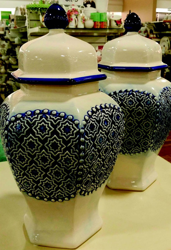
| This pair is a great addition for accessory vignettes because it has pattern and color mix. They made a splash with "Client A" for only $20 each. |
 |
| My entry hall of blue and white, shown here, makes me smile every time I pass. There is something whimsical and cheerful about it. I do have another console in place where keys and mail land. Find a space that makes you smile and have some fun experimenting. |
 |
| 4) Add something living. Please, with the bounty and beauty of summer, use fresh flowers or a potted blooming plant. One of my favorite things to do is use a blue and white cachepot with a blooming potted plant. Once the blooms start to fail, rotate it out to the garden and bring in another. It's a sweet budget buster for the garden as well. 5) Unlike jewelry where taking one piece off is de rigueur, sometimes with collections of blue and white, more is more. Not always, but sometimes. In my own home I have spaces that are very uncluttered and others, like my entry hall, which are more, say, packed with joy. Make sure you are following me on Instagram at https://instagram.com/annlmcdonald/ and on my blog as my team and I will be in New York City at the end of May bringing the stylish suburbanite design insider tips from Kips Bay Decorator Show House and the International Contemporary Furniture Faire. Blessings this May! |
 |
| Ann McDonald, IIDA, NAPO, is the Founder/CEO of Couture Chateau, a luxury interior design firm in Orinda. For a complete blog post including other design ideas, visit www.couturechateau.com/blog |
| |
|
|
|
|


